Reading an event page
Open any event from the map, the ticker or a search and it has a page of its own, with a stable address you can share. Everything on it is sourced: the agency behind the event, the time of its last update, and the model or dataset behind every derived figure.
Freshness first
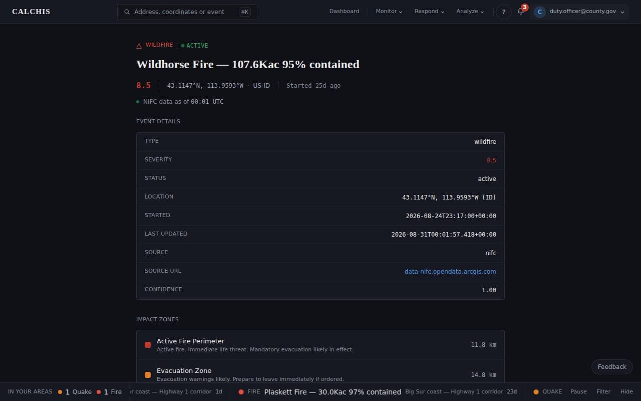
Under the title, a colored dot says how current the source is. Green is fresh; amber means the source has not updated on its normal schedule and the page may be behind it; gray means freshness could not be checked. A figure is only as good as the feed behind it, and the page says which feed and when.
The forecast
For hurricanes, wildfires, floods and earthquakes the page carries an indicative severity forecast: where the event is likely to peak and how likely it is to get worse, from a published model plus the event’s own trend, with the inputs it wanted and did not get named beside it. It is marked low confidence on purpose. The model has been run against seven historical events with the clock wound back to the hour of the forecast, and the results — four right, three wrong, and why — are on the methodology page. Read the forecast as a lean, not a number.
What the page is not
Impact zones are estimates from published models and may differ from local conditions; counts of schools, stations and structures are for situational awareness, not for actuarial or regulatory use. For evacuation and safety decisions, follow your local emergency management agency.
For a flood warning the innermost zone is the National Water Center’s modeled inundation — where the National Water Model put water at its last analysis, inside the NWS warning polygon, and marked experimental. The warning polygon is the official boundary and is drawn as the next zone out. A reach the model does not cover shows the warning polygon alone; a flood watch, being a forecast, never has water drawn.
Step by step
Step 1: Check what it is and how fresh it is
The header gives the peril, the status, the severity on Calchis's 0–10 scale, the location and when it started, with the source's freshness beneath. Event details names the source and links to the agency's own record.
Step 2: Read the impact zones
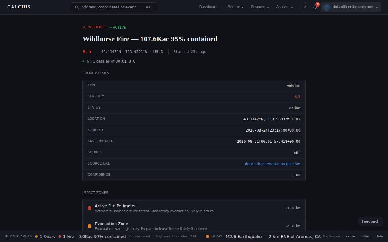
Each zone is drawn from a published model for the peril and says what it means for people inside it, from the most severe outward, with its radius. On the map, the same zones are the colored and patterned rings around the event.
Step 3: See what is inside, and what it resembles
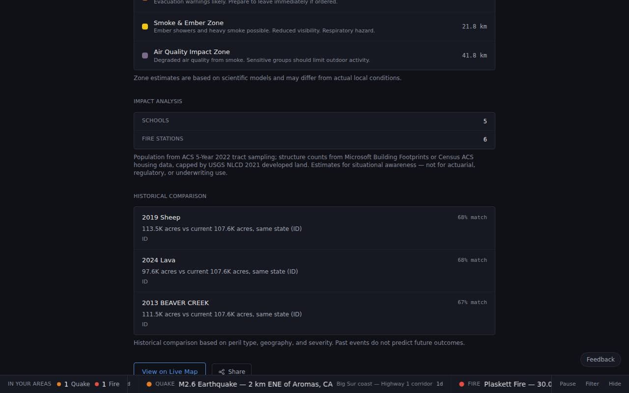
Impact analysis counts schools, fire stations and other critical facilities inside the zones, with the data behind each count. Historical comparison lists past events of the same kind in the same state, nearest first. Past events do not predict this one; they give it scale.
Last updated September 23, 2026
Related Guides
Decision-support intelligence — not a primary alerting or dispatch system. Verify against official sources.Guides describe how the platform works; they are not a substitute for professional actuarial assessment or for the official guidance of the agencies responsible for an incident.