Using the live map
The live map shows every active event Calchis is tracking in the United States, drawn from the federal feeds behind each one. This is how to make it open where you work, show what you need, and stay where you left it.
Where it opens
The map opens at the first of these that exists: the view in a link someone sent you; where you left it in this tab; your home view; the areas you monitor; the whole country. So a signed-in account with areas opens on its own jurisdiction without any setup, and coming back from another page puts the map exactly where it was.
The address bar always carries the view you are looking at, and the event you have open. Copying it copies both — the simplest way to put the same picture on a wall display or in someone's inbox.
What is not on the map
A forecast cone is not an impact area: it is where the storm's center will probably go. Consequence rings are estimates from published models, and may differ from local conditions. The map is decision support; verify against official sources before acting.
Step by step
Step 1: Read the map
Each marker is one event; its shape is the peril and its shade is how severe. Numbers are clusters — zoom in to split them. The list on the left carries the same events, and its filters apply to the map as well.
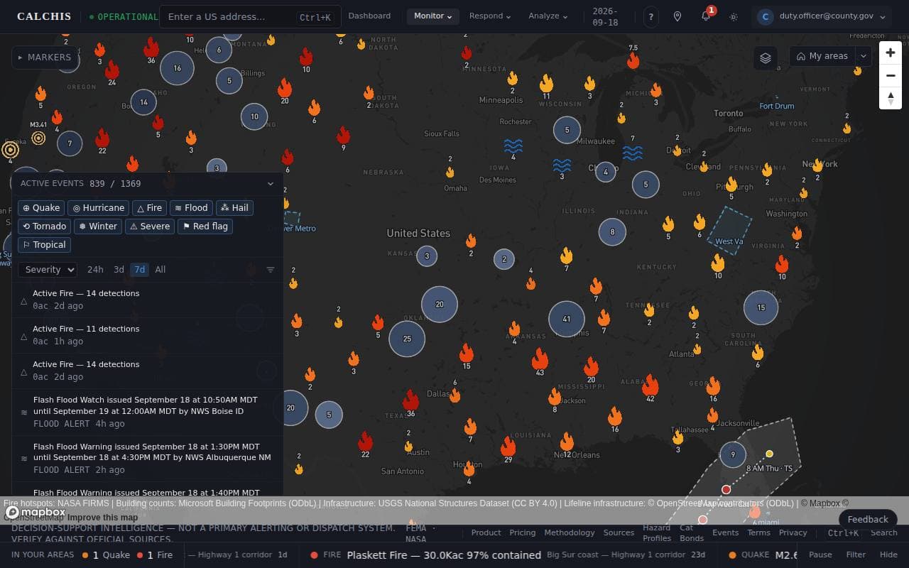
Step 2: Set a home view
Zoom to the area you work, open the menu beside Home and choose Set this view as home. Signed in, it is saved to your account, so every device you sign in on — including the wall display — opens there. Press H anywhere on the map to go back to it. With no home set, the button takes you to your monitored areas instead. The same actions are in the command palette: press Ctrl+K (⌘K on a Mac) and type “home”, or pick one of your areas there to jump straight to it.
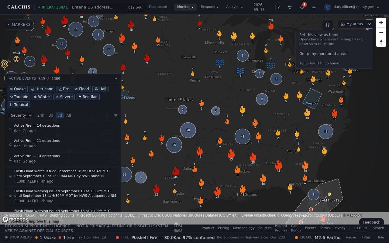
Step 3: Choose what is drawn
The layers button (top right) switches satellite imagery, event markers, impact zones, storm surge, the NHC forecast cone, traffic cameras, your monitored areas and critical infrastructure. Your choices are remembered in this browser.
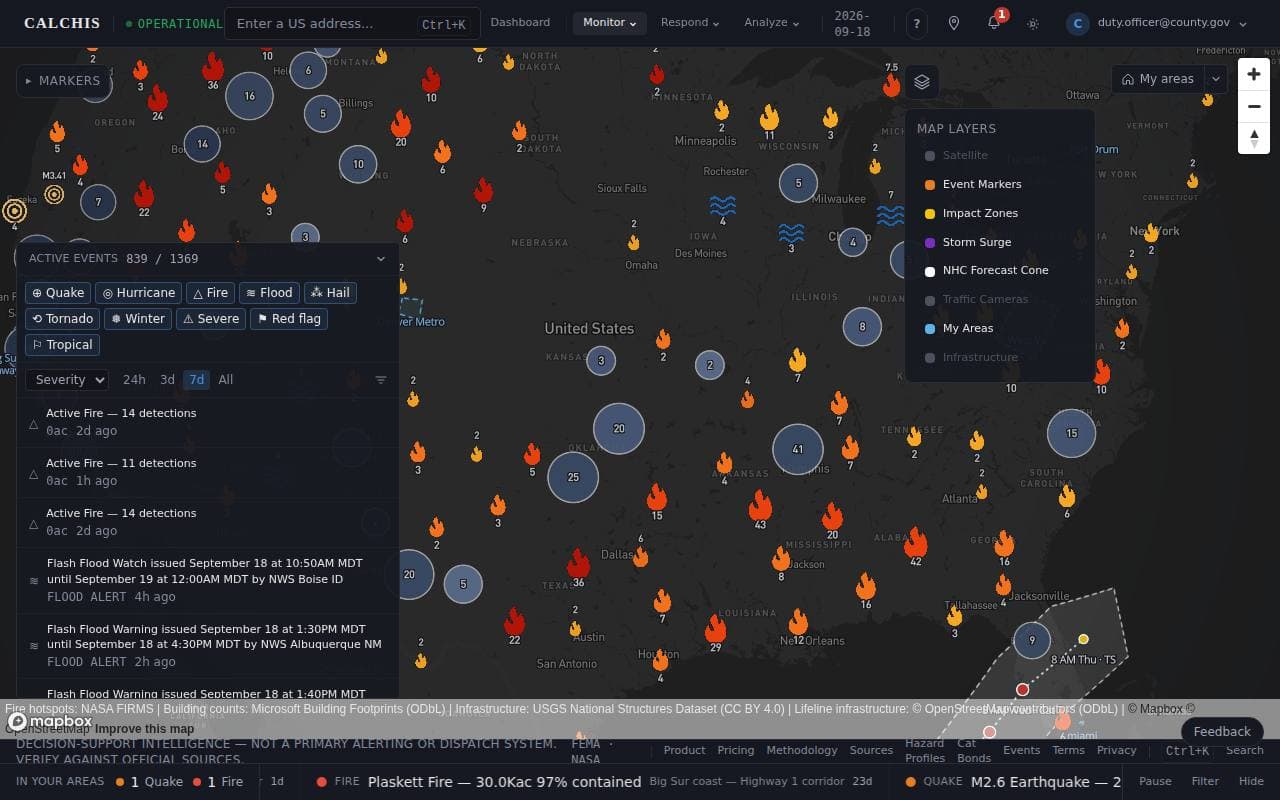
Step 4: Read a hurricane's forecast
For an active hurricane the map draws the National Hurricane Center's own 5-day forecast: the white cone, the dotted track, and each forecast position labeled with its time and intensity. The cone is where the center will probably go — impacts reach well beyond it.
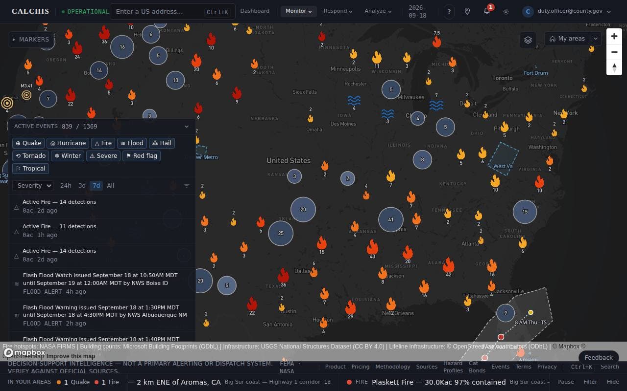
Step 5: Look up an address
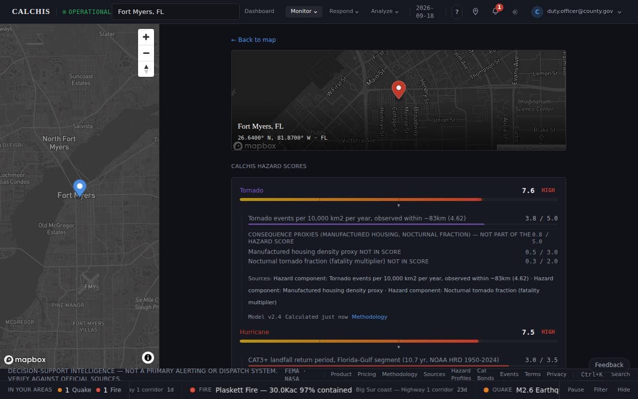
Type an address in the search box. The map narrows to a reference pane with a pin on the address, and the hazard profile opens beside it. Back to map returns you to the view you had before you searched.
Last updated September 18, 2026
Related Guides
Your HVA and the triggers that activate your plan
Facility emergency managers · Facility safety leads
MonitorCompleting your Hazard Vulnerability Analysis
Facility emergency managers · Facility safety leads · Health-system safety officers
MonitorWhat's coming for your areas
Emergency managers · Duty officers
Decision-support intelligence — not a primary alerting or dispatch system. Verify against official sources.Guides describe how the platform works; they are not a substitute for professional actuarial assessment or for the official guidance of the agencies responsible for an incident.